The online learning experience leans toward being a visual one. That makes the design of your course an important consideration. A good practice is to imagine your students sitting in front of their computer screen looking at your course site. Can they immediately grasp what it is they are looking at? Do they know what to first? Do they know where to find the instructional elements? Do they know what to do next?
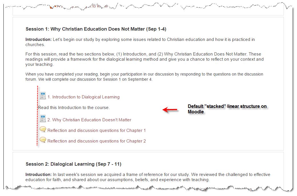
Moodle has a “linear” and “stacked” format to it. As you build the elements of a particular segment, the default option is to “stack” the elements, one below the other, presumably, in sequence. While Moodle provide visual icon as cues to each element, they are a bit cryptic (see below the examples of a “Page” icon and a discussion forum icon).
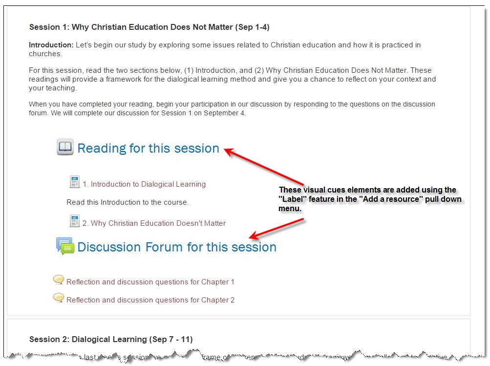
You can aid the flow and ease of use of your course site by adding visual elements that make it easier for your students to identify the instructional components on your course. Below are examples of two visual cue elements. One identified and directs the student to the reading for the session, and the second highlights the discussion forum element. You can always add additional instruction as text to each element, but with these cues, one can reduce the clutter on the screen. Using the cues consistently allows the student to immediately recognize what they are looking at and what they are to do with it.
HOW TO MAKE YOUR OWN VISUAL CUES
One very easy way to create your own visual cues is on Powerpoint—the poor person’s graphic program. Open a blank slide on Powerpoint and import or cut-and-paste your icon graphics, then use the textbox function to create your label. Resize your image on the screen to fit best your Moodle platform (you may need to experiment a bit), then use your computer’s clipping tool to clip the image. Save it as a graphic file (jpg), then import it to Moodle using the “Label” function.
Small but strategic design elements like these can go a long way to making the online learning experience smoother for your students.


