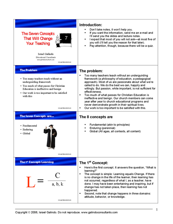
A friend asked me how I prepare my speaker notes for Powerpoint presentations. He saw that my speaker notes had the slide images on one side of the page with the corresponding notes on the other (with about four slide images to the page). He was not satisfied with the default Powerpoint printouts that came out with one huge slide image on the top half of the page and the notes on the bottom half of the page. Beside using up a lot of printer ink, it required him to flip a page for each slide.
As with most things related to the personal computer, there’s more than one way to do something. In the case of printing out a two-columed speaker notes page for slide presentations, here are two options.
The easy way is to use the program Articulate. It has a nice option feature that automatically formats a Powerpoint presentation into a Word document in a “storyboard” format. Because it prints the file in Word it is editable. For example, one the program creates the storyboard I change the page orientation to portrait, change the footer information, and edit the lecture notes. I also change the chart grid outlines to suit my taste. Go to www.articulate.com You can download a FREE trial version. It’ll expire in about 30 days, but you can use all the features in the meantime, and, you may find the rest of the Articulate program helpful enough to purchase.
A second way to create lecture notes in the above format is as follows:
- Open a Word document
- Create a two-columned table using the “create column” feature.
- Create your table with as many rows as you need for the presentation (i.e., one row per slide)
- You will fill in the right column with your notes.
- On the left column you will insert the slides graphics.
To create and insert the slide graphics:
- Open your Powerpoint presentation and select the “Slide Sorter View”
- For each slide, “copy” it (right-click on the slide and select “Copy”)
- Go to the Word file and “paste” the slide graphic within the left side column box where you want it (the corresponding notes will be on the right column)
- Do this for each slide
- Resize the slide graphic as you need.
Resist filling in the right side lecture notes section with a lot of material. Use an outline format with your key points and key phrases. If you write out the material you’ll wind up reading from your notes.
Remember that you are the presentation, not your slides. Your slides should serve the function of “focal points”. Never, ever, fill a projected slide with text! Ever! Projected slides are not for reading—not by you or by your audience. Your slide focal points should serve these functions: (1) be a “visual metaphor” for what you are speaking about, (2) serve as cues to transitions, (3) provide a visual rendering of a complex abstract concept, (4) show an illustration or model, (5) provide a visual “placeholder” for the reader, (6) serve as an induction method (starting the presentation, summarizing a section of the presentation, summarizing the end of the presentation, and concluding the presentation).


